Royal Blue vs Navy T-Shirt: How to Tell the Shades Apart and How a Bulk Buyer Avoids Getting the Wrong Shade
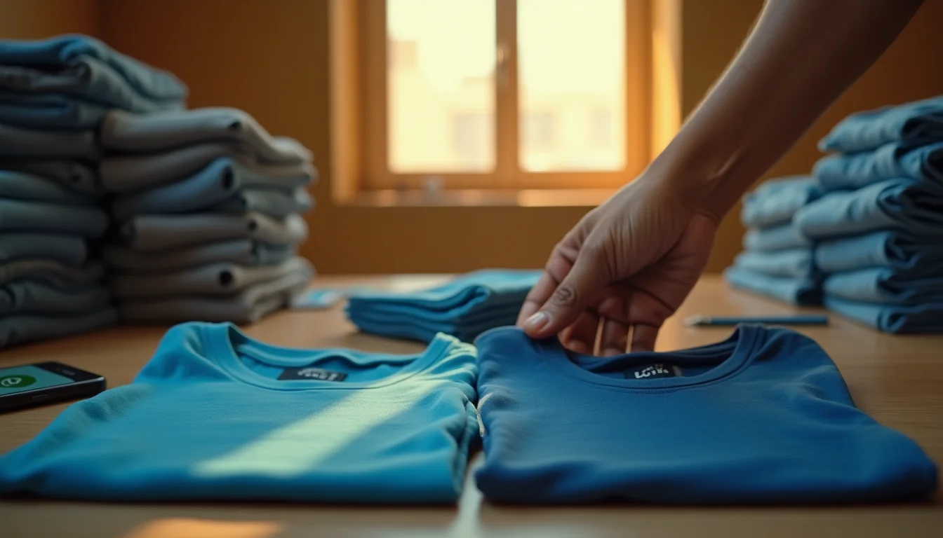
Of all the colour confusions that arise in the plain t-shirt wholesale trade, the royal blue versus navy swap is by far the most common. The two shades share the same blue family. They look dramatically different outdoors, yet they can appear almost identical under certain artificial lights. For a custom printing business — DTG, screen print, DTF, or heat transfer — the difference matters enormously: a royal blue base fabric does not carry the same visual weight as navy, and mismatched bulk stock means an entire print run goes out the door in the wrong colour.
This article is written for B2B buyers who purchase plain t-shirts in bulk: the printer who needs 200 pieces of the same shade, the brand owner who is building a new line, and the distributor who resells to local printers. The goal is to give you practical, actionable knowledge so that you never receive a shade you did not approve — not because of a supplier error, but because you understood the process and protected yourself before the bulk was dispatched.
Before we go further: if you are new to terms like GSM, bio-wash, or pre-shrunk cotton, you can find a clear explanation on the BulkPlainTshirt.com FAQ page. This article assumes you already know the basics and focuses entirely on the shade-matching problem.
What Actually Separates Royal Blue from Navy?
At the dye chemistry level, both shades use reactive dyes on 100% cotton. The distinction is in the hue value and depth of shade (DOS). Royal blue sits at a medium-to-high saturation, vivid, bright, and unmistakably blue to the eye. Navy sits at a very high depth of shade — it is so deeply dyed that it absorbs most of the visible light hitting it, and the blue component becomes secondary to an almost dark, near-black appearance under low light.
| Property | Royal Blue | Navy |
|---|---|---|
| Hue family | Medium blue, vivid | Dark blue, near-black depth |
| Depth of shade (DOS) | Medium-high | Very high (deeply dyed) |
| Appearance in direct sunlight | Clearly bright blue | Dark blue, distinct from royal |
| Appearance under cool tube light | Can look darker, closer to navy | Can look almost black |
| Appearance under warm incandescent light | Shifts toward purple-blue | Shifts toward very dark grey-blue |
| Phone camera (auto white balance) | Often rendered darker or saturated differently | Frequently rendered as black in photos |
| Common mistake direction | Sometimes delivered instead of navy | Sometimes delivered instead of royal blue |
| Print contrast with white ink | Good — white pops on medium blue | Excellent — white is very sharp on dark base |
The table above is built from the real colour range available in BulkPlainTshirt.com's plain t-shirt catalog. Both royal blue and navy are stocked colours in the 15+ colour range — they are not custom dye runs, which means the dye formula is standardised. Yet even within a standardised formula, lighting and reproduction media introduce significant visual distortion. Understanding those distortions is the first protection a bulk buyer has.
Why Lighting Changes Everything: Tube Light, Daylight, and Warm Light
Cool Fluorescent / Tube Light (Most Shop and Warehouse Environments)
The standard tube light used in Indian godowns, printing shops, and retail counters is a cool white fluorescent lamp. Its colour temperature sits roughly between 4000 K and 6500 K, and it emits a spike in the blue-green part of the spectrum while suppressing red. Under this light, navy t-shirts absorb so much red and green that they appear almost black. Royal blue, which reflects more blue, can also look darker than it truly is and can be mistaken for a very dark navy. Two pieces placed side by side in a tube-lit room will show a difference — but the perceived difference is significantly smaller than in daylight.
This is the single most dangerous environment for shade approval. If you are inspecting incoming stock in a warehouse with only tube lights overhead, you are working with a compressed colour perception. The practical remedy is discussed below.
Daylight (North-Facing Window or Open Shade)
D65 — the standard daylight illuminant used by textile laboratories worldwide — corresponds roughly to open-shade daylight on an overcast day, colour temperature around 6500 K. Under natural daylight, the full spectral reflectance of both shades is revealed. Royal blue looks unmistakably vivid. Navy looks unmistakably dark. The gap between them is obvious. This is why daylight (or a D65-calibrated lightbox) is the only trustworthy environment for shade comparison.
Warm / Incandescent / Sodium Vapour Light
Warm yellow light, such as a tungsten bulb or sodium vapour streetlight, suppresses the blue end of the spectrum entirely. Under this light, royal blue can develop a strange grey-violet cast, and navy can look so dark and brown-tinged that it is almost indistinguishable from black. Buyers who inspect t-shirts under warm lighting in the evening are working with the least reliable environment possible for blue-shade discrimination.
Why Your Phone Camera Cannot Be Used for Shade Approval
This point deserves its own section because the practice of sending mobile phone photos for "colour approval" has become extremely common in the B2B t-shirt trade. It is, unfortunately, one of the most unreliable methods possible.
Smartphone cameras have auto white balance (AWB) systems that try to neutralise the colour of the ambient light in every photo. This means the camera automatically adjusts what it captures to make the scene look "natural." The problem is that AWB treats the dominant tone in the frame as a reference and compensates against it. When you photograph a navy t-shirt in a cool-lit room, the AWB may push the image further towards blue to compensate for the cool cast — sometimes making navy look almost royal blue. Conversely, in warm light, the AWB may push the image towards cooler tones, making royal blue look greyish-dark.
Additionally, phone screens vary. The same image will look different on a high-saturation AMOLED display versus a standard LCD. An image that looks navy on one device can genuinely look royal blue on another, depending on colour profile settings.
The additional problem is JPEG compression and screen colour profiles. Even if the camera captured the image accurately, the compression algorithm selectively alters colour values, and the display on the receiving phone shows it differently than the sending phone intended.
Screen colour is a representation, not a specification. A physical swatch is a specification.
This is not a criticism of any supplier or buyer — it is simply physics. The solution is not to find a "better camera" but to stop using cameras for shade approval entirely and rely on physical samples instead.
What Is Dye-Lot Variation and Why Does It Happen?
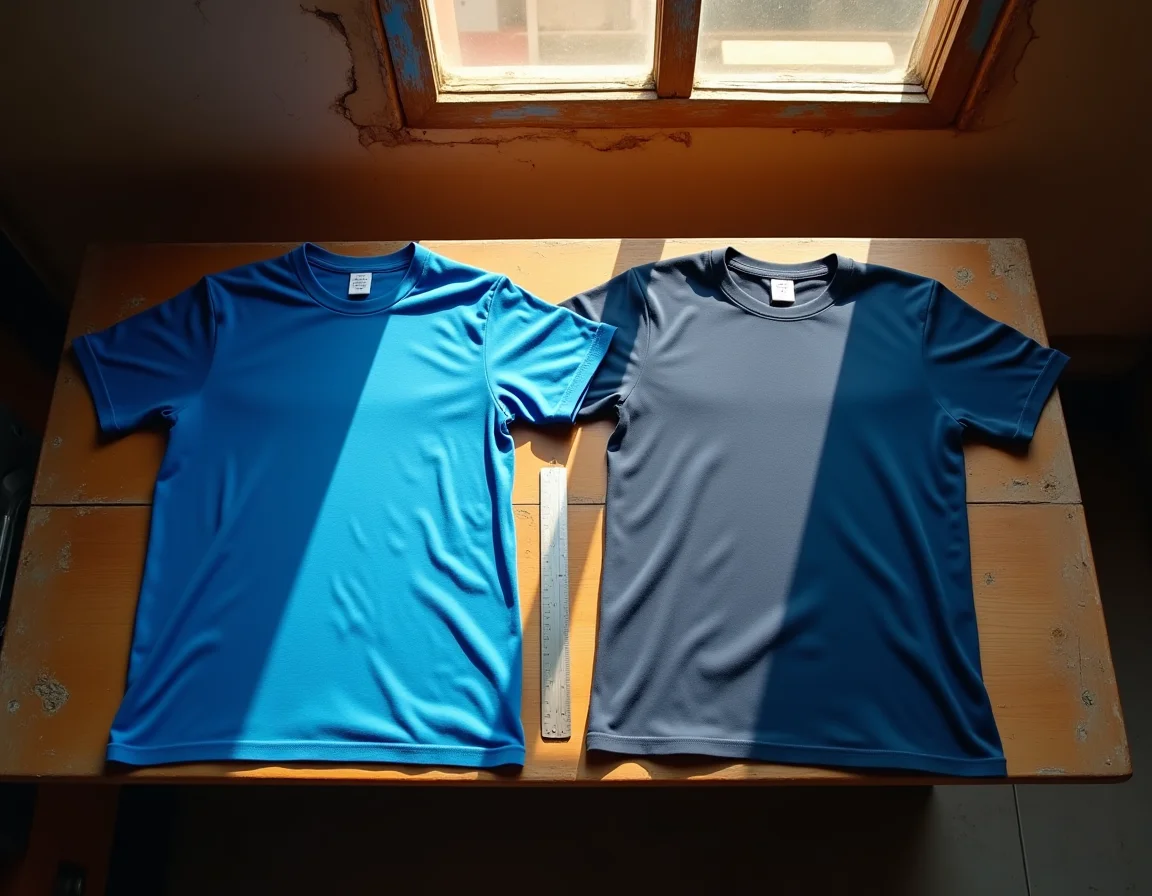
Even when a supplier uses the same dye formula for the same shade — say, navy at a fixed depth of shade — two separate production batches of fabric will show a small but visible difference in shade when placed side by side. This is called dye-lot variation (also called lot-to-lot shade variation), and it is a normal, industry-wide phenomenon in all textile dyeing.
The Root Causes of Dye-Lot Variation
- Water quality: Dyeing is an aqueous process. The mineral content and pH of water used in different batches — even from the same source — varies slightly across seasons. This affects how dye molecules bond to cotton fibre.
- Temperature control: Dyeing machines maintain temperature within a tolerance band, not a precise single value. A difference of even 2–3°C in the dye bath temperature across batches shifts the final depth of shade.
- Dye weighing accuracy: Even with automated dispensing systems, dye powder and dye solution weighing carries a small tolerance. Over a large batch, this translates into a visible shift.
- Fabric greige variation: The raw fabric (greige) going into the dyeing machine may have slightly different fibre absorbency between different knitting lots. Ring-spun combed cotton fibre, while consistent, still carries natural variation from bale to bale.
- Liquor ratio variation: The ratio of water to fabric weight in the dye bath affects shade depth. A minor difference in loading between batches changes the final result.
How Much Variation Is Normal?
The industry standard for acceptable lot-to-lot shade variation is assessed using a grey scale — a standardised scale from 1 (severe difference) to 5 (no difference). For commercial garment dyeing, a grey scale rating of 4 or 4–5 is considered acceptable for the same nominal shade. What this means in practice: two batches of navy from the same supplier, dyed on different days, will look identical at arm's length when placed next to each other in daylight. However, under a magnifying glass or under certain angles of light, a trained eye will notice a slight difference.
Buyers who receive, say, 200 pieces from one dye lot and then reorder 300 pieces from a later dye lot may notice that the two sets are not a perfect match when placed together directly. This is not a defect. It is an inherent property of wet processing in textiles. The same variation occurs at every manufacturer globally, including brands at all price points.
This is also why quality-conscious bulk buyers who understand garment quality checks for bulk orders build dye-lot verification into their intake process, not just stitching or measurement checks.
How to Compare a Physical Swatch in Daylight: The Right Technique
A physical swatch is the only reliable reference for shade approval. Here is how to use one correctly:
- Use a north-facing window or open shade. Direct sunlight on a sunny day creates a high UV component that can make colours appear bleached. A north-facing window or an overcast-sky outdoor area gives the most stable D65-equivalent light. If you are in a cloudy or monsoon-season location, open shade is still preferable to any indoor artificial light.
- Hold both pieces flat and parallel. Do not fold one and lay one flat. Hold them at the same angle relative to the light source. The angle of incidence affects perceived lightness, especially on cotton jersey which has a slight sheen due to the bio-wash treatment.
- Compare against a neutral background. The colour of your hand or a coloured surface behind the swatch will shift your perception of the fabric's hue through simultaneous contrast. Use a white or mid-grey backdrop — even a sheet of white paper behind the swatch improves accuracy.
- Give your eye time to adapt. Look away from the swatches for 10 seconds, then look back. Prolonged staring at a saturated blue can temporarily fatigue the blue-sensitive cones in your eye, skewing your comparison.
- Compare at three distances. At 10 cm (close inspection), at arm's length (60 cm), and at 2 metres (how a garment is typically seen when worn). A shade that looks identical at close range may show a slight difference at a distance, or vice versa. For print businesses, the 60 cm distance is most relevant as that is how a finished printed garment is typically assessed.
The Physical Sample and Retained Swatch System: Your Pre-Bulk Protection
The most reliable way to prevent receiving the wrong shade in a bulk order is a two-step process used by professional garment buyers: physical sample approval followed by retained swatch storage.
Step 1 — Request a Physical Sample or Swatch Before Placing Bulk
Before committing to a large quantity order, request a physical sample or a small quantity from the actual stock that will be dispatched. At Sale91.com, the ready stock of 1 lakh+ pieces means your sample and your bulk order draw from real, available inventory — not from a future production run. This is a significant advantage: when the sample is approved and the bulk is dispatched from the same available lot, the shade match is reliable.
Suppose you are ordering 500 pieces of royal blue 200 GSM round neck t-shirts. Before confirming the full quantity, order a few pieces first and check them against your requirements: your print substrate expectations, your client's reference, and your own daylight swatch comparison.
Step 2 — Retain a Physical Swatch and Mark It
After you approve the sample, cut a small swatch from one of the sample pieces — approximately 10×10 cm is sufficient. Store it in a zip-lock bag away from light and moisture. Write on a paper tag inside the bag: the shade name, the order date, the supplier lot reference if available, and the GSM. This becomes your reference swatch.
When the bulk delivery arrives, the very first action should be to pull out this retained swatch and compare it against pieces from different cartons of the bulk delivery — not just the top piece. If the bulk pieces match the retained swatch in daylight comparison, the shade is correct. If there is a visible difference, you have an objective physical reference to support a conversation with the supplier.
Why Retained Swatches Matter for Multi-Order Continuity
For buyers who reorder the same shade repeatedly — for example, a screen printer who runs navy t-shirts for a regular institutional client — keeping the retained swatch from the first approved order allows you to check every subsequent delivery against the original reference. This is how professionals manage dye-lot variation across multiple orders over time.
Without a retained swatch, the only comparison you can make when receiving the fifth reorder is against your memory of what the shade should look like. Memory of colour is notoriously unreliable — the human eye adjusts its perception of colour based on whatever is currently in the environment.

Minor Lot-to-Lot Shade Variation: A Textile Normal, Not a Defect
This section exists because shade-related disputes in the B2B t-shirt trade often arise from a misunderstanding of what constitutes a defect versus what is a manufacturing normal. The textile industry worldwide — from Tiruppur to Bangladesh to Turkey — operates on the understanding that minor shade variation between dye lots of the same colour is not a quality failure. It is inherent to the wet processing of natural fibres.
A defect in shade would be: receiving royal blue when you ordered navy (a wrong shade, not a variation); receiving pieces within one dye lot that show visible shade banding (a dyeing process failure); or receiving pieces where the shade is significantly lighter or darker than any reasonable interpretation of the approved sample (outside the commercial tolerance range).
What is NOT a defect: a slight perceived difference between your retained swatch from six months ago and your fresh delivery today, where both match the shade name and both fall within the grey scale tolerance for that colour family. This is especially relevant for deep shades like navy, where even a very small shift in dye percentage creates a perceptible visual difference because the human eye is sensitive to depth-of-shade changes in the dark blue-to-black range.
Understanding this protects both buyer and supplier. It also reinforces why the swatch retention system described above is so valuable: it gives you an objective physical tool to distinguish a genuine defect from a normal manufacturing variation.
For buyers who are also thinking about how GSM and yarn quality relate to print performance on these shades, our article on why GSM alone does not define fabric quality explains how ring-spun combed cotton construction matters as much as weight.
A Shade-Approval Checklist for Bulk Plain T-Shirt Buyers
Use this before any blue-family bulk order is confirmed and dispatched:
- Request a physical sample or small lot before committing to full bulk quantity
- Compare the sample against any client reference in direct daylight or open shade — not under tube lights alone
- Hold both pieces flat against a white background at arm's length for the most honest comparison
- Confirm the exact shade name in writing with the supplier — "royal blue" or "navy," not just "dark blue"
- Check the sample under your shop's tube light as well, so you know how it will look in your own workspace
- Cut and retain a 10×10 cm swatch from the approved sample; store it properly labelled
- On bulk delivery, immediately compare pieces from at least three different carton positions against the retained swatch in daylight
- If ordering for a continuing client, confirm whether the new delivery lot matches your retained swatch before printing begins
- Do not approve shade via phone photo — only by physical comparison
- If reordering the same shade from a new dye lot, communicate the lot-variation expectation to your end client before delivery
How Sale91.com's In-House Knitting Reduces (But Does Not Eliminate) Lot Variation
Because Sale91.com / BulkPlainTshirt.com knits its own fabric in-house at the Tiruppur manufacturing facility — rather than sourcing greige fabric from external mills — there is one fewer variable in the shade consistency chain. The fibre quality, knit construction, and fabric weight are controlled before the fabric enters the dye house. This reduces variability from the greige stage, which is one of the root causes of lot-to-lot shade differences described earlier.
Additionally, with over 1,25,000 pieces dispatched in the last 30 days and a standing ready stock of 1 lakh+ pieces, a large proportion of orders are fulfilled from existing dyed stock rather than freshly dyed batches. For a buyer placing a 500-piece order, drawing from a single large ready-stock lot is considerably more shade-consistent than ordering from a freshly dyed small run. This is a practical manufacturing advantage worth understanding when you choose between a trading intermediary and a direct manufacturer like Sale91.com.
That said, even with in-house knitting and large dye lots, the fundamental chemistry of reactive dyeing on cotton means that different production cycles of the same shade will carry a minor variation. The swatch retention and daylight comparison process described in this article applies regardless of supplier.
You can browse the full range of available shades — including both royal blue and navy across GSM options from 180 to 430 — in the product catalog at BulkPlainTshirt.com.
Practical Decision Table: Which Blue for Which Use Case?
This original decision table is built from the actual product range and printing trade considerations — use it to advise your clients or make your own stock decisions:
| Use Case | Recommended Shade | Reason |
|---|---|---|
| White or light-coloured DTG print | Navy | Dark base gives maximum contrast; white ink is sharp and vibrant |
| Full-colour photographic DTG print | Royal Blue | Lighter base allows CMYK ink to render mid-tones more accurately |
| Screen print — single colour white | Either (navy preferred for drama) | Both work; navy creates bolder visual impact for logos |
| Heat transfer vinyl (HTV) | Royal Blue | Lighter base makes multi-colour HTV easier to design around |
| Institutional uniform (matching across departments) | Navy — single dye lot | Uniformity is critical; navy is easier to match lot-to-lot than medium blues |
| Streetwear / casual retail | Royal Blue | Vivid shade reads as fashionable; navy reads as corporate/classic |
| Acid wash base fabric | Navy (pre-wash) | Acid wash process lightens deep shades into attractive graduated blues |
| Export orders (EU/US market) | Confirm client Pantone reference | International clients use Pantone TPX/TCX specifications — match against physical, not screen |